Overview
Since March 2024, I’ve worked full-time as Navi’s in-house Webflow developer and site manager, taking ownership of a contractor-built site and shaping it into a fast, scalable, and measurable platform.
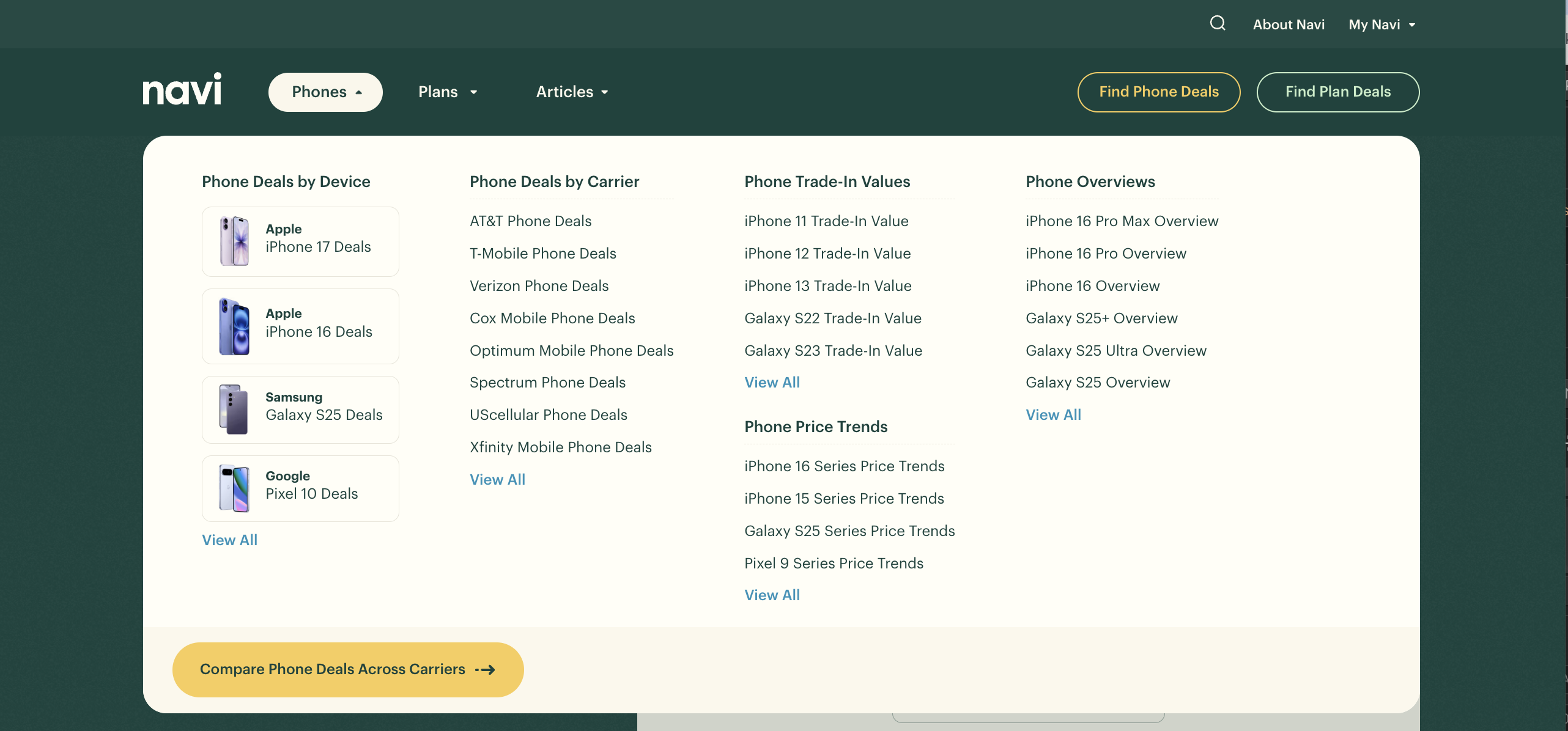
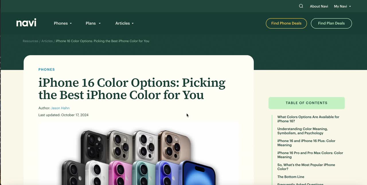
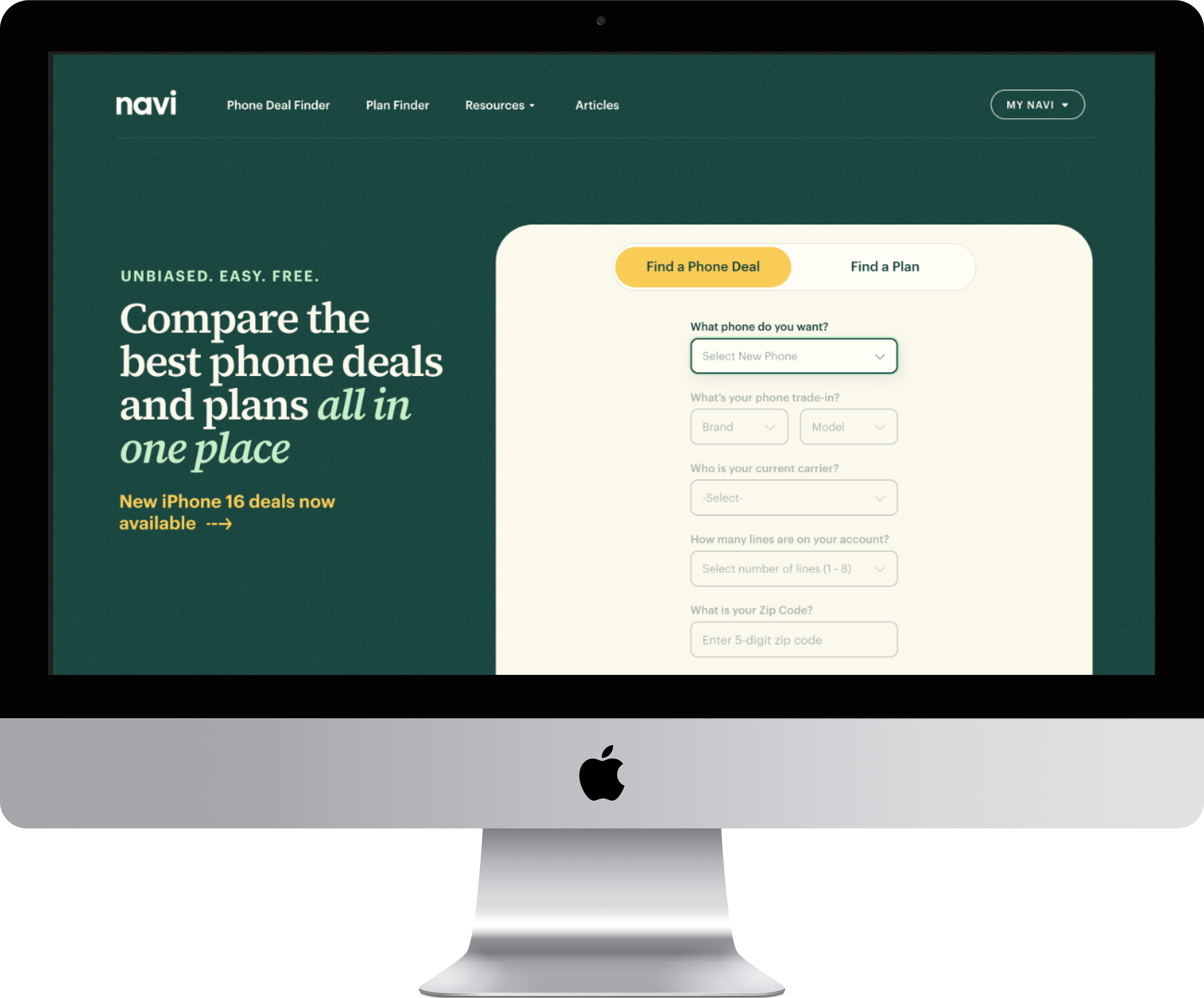
Navi is a consumer tech startup that helps people compare phone plans and devices to find the best deal. The site aggregates daily pricing data from carriers and retailers, offering tools like coverage maps, price trend charts, and trade-in calculators. With thousands of users relying on the site to make purchase decisions, performance, SEO, and conversion optimization are central to Navi’s growth.
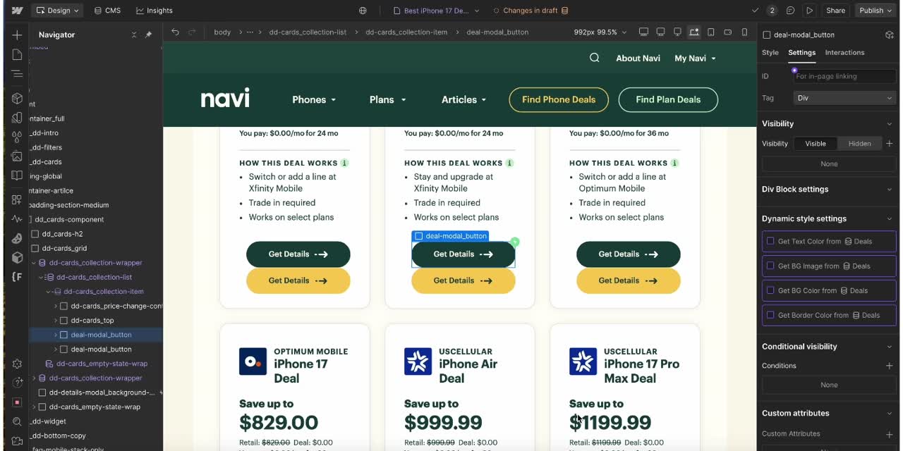
In my role as Webflow Site Manager, I act as the connective tissue between content, design, product, and engineering, moving Webflow projects forward from kickoff to launch.
I use my background in design, dev, and content to contribute many way from performance and SEO improvements, to measurement and experimentation, to UX and conversion wins, to content systems and team enablement, all of which I expand on below.
Jump to a section:
- Technical Peformance and SEO
- Measurement and Experimentation
- UX and Conversion Improvements
- Content Systems and Team Enablement
Challenge
Solution


Results